Packaging for Supplements: A Minimalist Approach to Wellness
This project was all about giving wellness supplements a fresh, eye-catching look that really stands out! I had a blast diving into the brand’s personality, dreaming up a cool new logo, and setting the whole vibe for their product line.
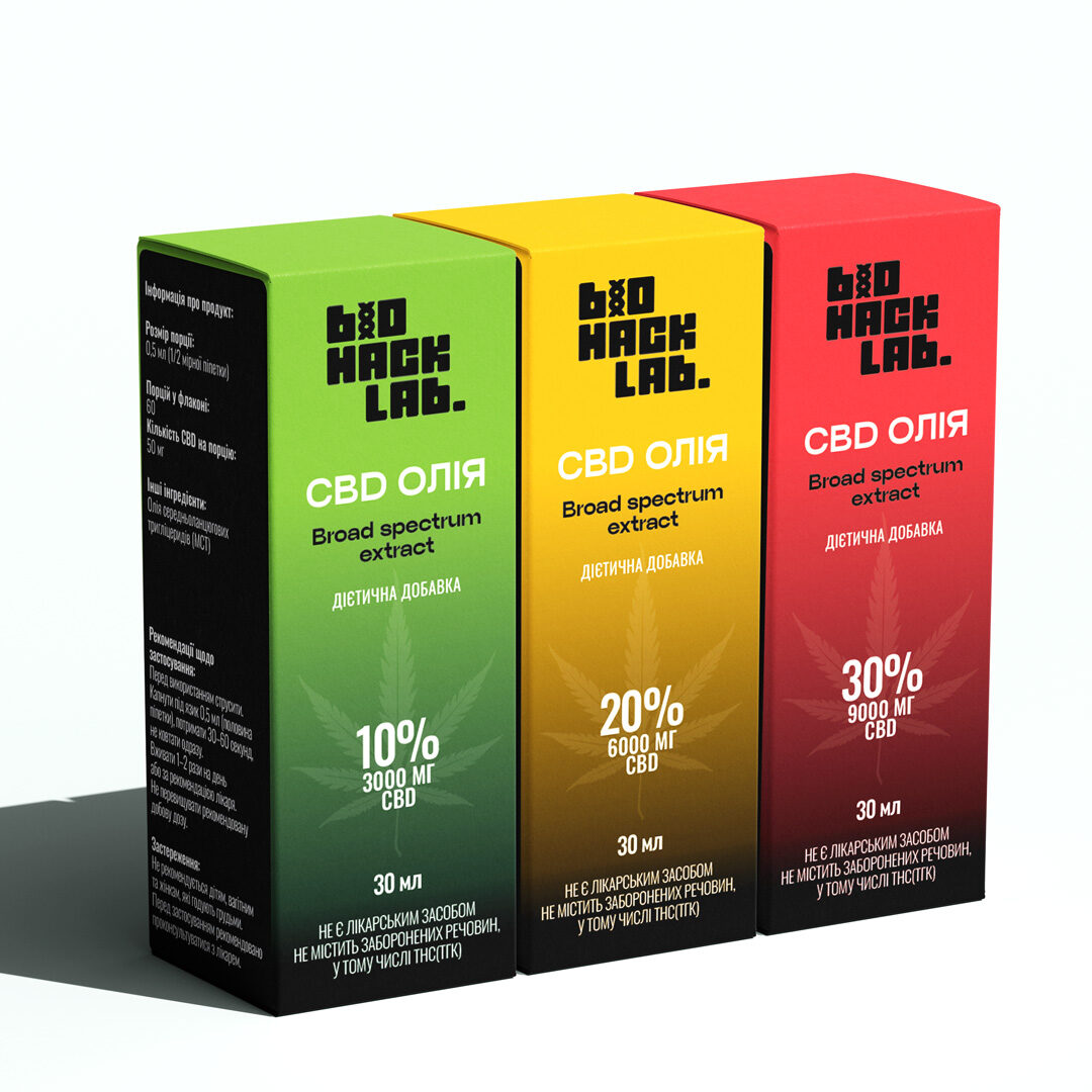
Take the CBD Oil, for example. We crafted a sleek little bottle that’s super easy to use, tucked neatly into its own custom box. My favorite part? We used these gorgeous, juicy color gradients – from fresh green to sunny yellow and fiery red – to instantly tell you how strong each one is. It’s all about keeping things clean and modern, but with a vibrant splash of color that just makes you feel good.
Take the CBD Oil, for example. We crafted a sleek little bottle that’s super easy to use, tucked neatly into its own custom box. My favorite part? We used these gorgeous, juicy color gradients – from fresh green to sunny yellow and fiery red – to instantly tell you how strong each one is. It’s all about keeping things clean and modern, but with a vibrant splash of color that just makes you feel good.